


Home : Conceptual : Page 9
Livingston, Francis
Francis Livingston was born in Cortez, Colorado and ranks as one of the top American illustrators. His early works, which were influenced by Sargent and Whistler, were painted in a monochromatic style. Upon moving to the San Francisco Bay area he started to experiment with color which led to a fondness for the California and French Impressionists. Francis Livingston lived and painted in San Francisco for 20 years and then five years ago he moved his family to Sun Valley, Idaho, where he developed a deeper appreciation for the west.
Collins, Matt
Finding humor in the sequence of odd scenarios that become our life. Conceptual, humor, animals, caricature, people, political, digital, painterly
Tobin, Marc
With over 20 years of experience, Marc Tobin produces a wide variety of Creative Imagery ranging from Magazine, Children's Book and Poster Illustrations to Logo Design and Web Graphics.
Guion, Tamara
My work is very conceptual in nature and I try to add a bit of symbolism to everything I do.
McIndoe, Vince
Award winning artist Vince McIndoe was born in Canada. After graduating OCAD in 1985 with numerous scholarships, he became a celebrated illustrator as well as a successful fine artist. Vincent was featured in many magazines such as Allure and Applied art magazine. He was also a guest for international TV talk shows. Vincent has designed series stamps for Canada Post; The Canals of Ontario (1998), Toronto’s 200th Anniversary stamp, and 50th Anniversary of All Star Game stamp (2000) as well as a portrait of Queen Elizabeth (1996). Vincent also designed the Hudson’s Bay company’s 325th Anniversary commemorative Silver Dollar.
Previous clients include: Moet & Chandon, Stolichnya Vodka, Big Apple Circus, Crush Wine Bar, Wine Spectator, Tokaji, Anheuser-Busch, Zinfest, and many more.
Vincent’s posters and paintings are housed and viewed in private and public collections worldwide.
Vorlet, Christophe
Conceptual illustrations for magazines, newspapers, books, advertising and new media. In color or black and white.
Specialized in providing an image that corresponds to the content of the associated text.
Visualizing complicated concepts or objects that are difficult to describe textually.
Briers, Stuart
I am a London-based illustrator who creates imagery for a diverse range of advertising and publishing clients throughout the USA and UK. I create concept orientated illustrations for books and magazines through to packaging, brochures and annual reports.
Besom, Mae
Mae graduated from Sichuan Fine Arts Institute in 2003, she began work as a character designer in Sichuan, China; she then decided to embrace her love of illustration and has been working as a full-time children's illustrator since 2007.
Mae uses traditional media, pencil and watercolour to create texture and light within her enchanting illustrations.
Mae Besom is the illustrator of the #1 nationally best-selling What Do You Do With an Idea? The book written by Kobi Yamada tells a story of one brilliant idea and the child who helps to bring it into the world. As the child's confidence grows, so does the idea itself. And then, one day, something amazing happens.
Mae has also just finished illustration the sequel called What To Do With A Problem, out in bookstores from July 1st.
Client List Pearson Education Compendium Inc Random House Guideposts Usborne Publishing Orchard School District Nursery World
Larkum, Adam
It’s a love of drawing that drives Adam Larkum, and it’s something he practices every day, constantly coming up with quirky new characters and putting them in hair-raising situations. And if you chat with Adam for a while he has a few real life hair-raising situations to recount. While he was a teenager, his family lived in Alexandria, Virginia for a while where Adam became the projectionist in the town’s cinema. When the bulb blew during the scariest part of Friday The 13th the crowd poured out of the cinema like a lynch mob…
This didn’t deter Adam from studying animation once he got back to the UK, and as a student he won a competition to create a short film for MOMI and Channel 4. Once his career producing animated commercials was under way, he became an illustrator as well. He’s now created over 30 children’s books, and illustrates for magazines and packaging.
Adam studied illustration and animation, and received a BA followed by an MA from the Edinburgh College of Art.
Adam believes every commission should start with a pencil in one hand and an eraser in the other, and is never afraid to erase whole areas of a drawing if they aren’t right. He loves working in ink on paper and then shifting into Photoshop to bring the piece together. If his work were a film, he says, it would be an Ealing Comedy – fun, fast and eccentric.
Client List Taylor’s Port BBC Island Bakery Green King Faber and Faber Puffin Books Usborne Channel 4 Cambridge University press Oxford University press Egmont Publishing Ziggurat Brands The V&A Museum Ask magazine Ink Robin
Jovellanos, Arielle
It’s impossible not to love the comic book style of Arielle Jovellanos. Fresh and light in tone, it’s set to take the graphic novel aesthetic into all sorts of new areas and Arielle is clearly an artist with a passion for visual storytelling.
Her big breakthrough came with her 2015 high school romance School Spirit – 60 pages of high quality artwork. The publication received an Eisner nomination, which is the pinnacle in the world of comics. Today the artist is working with a range of top names in publishing, and looking for new people to collaborate with bringing stories to life.
A Filipina-American, Arielle grew up watching Disney movies and drawing her own variations on Sailor Moon in the margins of her schoolbooks. Today, she loves musical theatre, collects playbills, and her biggest influences are the manga artist Rumiko Takahashi, the book Howl’s Moving Castle, and Studio Ghibli’s movie Kiki’s Delivery Service.
Arielle graduated from Parsons The New School for Design with a dual degree in Illustration and Fiction writing in 2014.
Most of Arielle’s work is entirely digital – she sketches, draws the lines and colours her images on her Cintiq tablet. Pinks, blues and purples form her main palette.
Everything is a character’ is a piece of advice that guides Arielle’s comic art style. It means she focuses on creating tiny narratives within each image, using body language, facial expression, clothing and background detail. This builds personality in her work and makes people viewing it wonder what will happen next.
Client List Audible Little Brown & Company Oni Press Smithsonian Asian Pacific American Center IDW Publishing B**** Media National Inventors Hall of Fame
OFerrall, Zoe More
Zoe More O’Ferrall’s studio is situated in Notting Hill. It’s a prime position for an illustrator who loves markets. She’s right next to Golborne Road Antiques Market and minutes away from Portobello Road with its famous stalls selling old papers, postcards, vintage clothing, furniture, prints and more.
Further inspiration comes from a love of film and photography, like the colourful and imaginative work of Autumn de Wilde, Tim Walker, Wes Anderson and Juergen Teller. BBC Radio 4 is played constantly in her studio as she creates imagery for fashion and food brands, retailers, advertising agencies, publishers and more.
Zoe’s training began at Wimbledon School of Art, and she went on to do a BA at the London College of Communication as well as a postgraduate course at Central Saint Martins.
Zoe usually works in pen and ink – she has a broad collection of pens to choose from - and loves to draw by hand. She only uses a computer to plan compositions and to touch up the handmade images. Now and again she’ll experiment with collage and screen printing too.
Client List Absolut Vodka Amazon BBC Billboard Magazine British Vogue Cartier Charlotte Tilbury Costa Esprit Esquire ES Magazine The Guardian Harrods The Hollywood Reporter The Ivy Jo Malone J Crew JWT The Mayor of London Mr Porter More Than Mumford and Sons National Geographic New York Magazine Ogilvy Propercorn The Red Cross Renault Stella Artois Tesco Topshop The Times UGG Australia VCCP The Wall Street Journal The Washington Post YSL
Armstrong, Gail
Gail Armstrong has been creating paper sculptures for over 20 years and her enthusiasm for the medium hasn’t waned one snip. She still wants every image she creates to be better than the last, and this approach has led to plenty of awards, including a Cannes Gold Lion for her Kleenex campaign. She finds inspiration in contemporary art and, not surprisingly, the huge Paperchase outlet on Tottenham Court Road in London.
Gail did her foundation course at Sheffield Polytechnic before gaining both a BA and Post Graduate Diploma in Graphic Design and Illustration at Glasgow School of Art.
Though finally rendered in pieces of paper that have been carefully cut and glued together, each image Gail creates begins as a series of drawings. As she explores the composition and various concepts, she focuses on creating something that has both style and substance to it. The result is usually a photograph of her artwork, which viewers love to see more than once, poring over the textures, colours and patterns in the final construction.
Awards
Shortlisted in AOI Illustration Award 2014 - Research and Knowledge category for “Life Cycle of a Butterfly”
Asiago International Award for Philatelic Art 2012 - winner for “Land” stamp in set of 3 for United Nations conference on sustainable development in Rio
Cannes Gold Lion 2010 – Billboards Cannes Bronze Lion 2010 – Illustration Cannes Bronze Lion 2010 - Press The Big Won 2010 – 1st in Press Campaigns Creative Circle Awards 2011 Silver in Illustration (Craft Print) Creative Circle Awards 2011 Bronze in Magazine Campaign (Press) Creative Match Flair Award for Illustration 2011 Daler Rowney Award for Outstanding Paper Sculpture 1997
Client List
SunSense, Kleenex, United Nations, Charles Darwin University, Nestlé, Sogo Hong, Kong, Sandoz, Macy's, MidFirst Bank, California Lottery, Delta TechOps, Safeguard Handwash and Jack-In-A-Box.
Maguma
MaGUMa is the pseudonym for Spanish artist Marcos Guardiola Martín, who is based in Madrid and works for a growing number of publications and international brands.
Inspired by artists like Moebius and Milano Manara, as well as old adult comics like Metal Hurlant and El Vivora, MaGUMa has developed a style that’s bright, tactile and a little surreal.
MaGUMa studied at the School of Architecture in Madrid, but also took the opportunity to learn abroad in Mexico and Portugal during his education.
Although he works digitally, using a Wacom Cintiq graphics tablet and digital painting software, MaGUMa’s work has an increasingly handmade feel.
MaGUMa’s style will remind you of classic mid-20th century illustration work done in pastel or gouache, and sometimes it looks like a silkscreen print saturated with ink. He strives to give the work a tactile quality, inviting the viewer to try and touch it to feel the texture. Strong concepts and colours are also prevalent in his pictures.
Client List El País Courrier International El Malpensante Yorokobu Amanuta Tara Books
Richardson, Jack
Jack Richardson is an English illustrator in New York, with a clean and fresh comic book style that often features a touch of the unusual.
Originally from the South East of England, Jack is now based in Brooklyn where he does what he loves most – drawing.
Some of Jack’s main influences include the classic comic artists Alex Toth, Jean Giraud (Mœbius) and Hergé, as well as the painter Daniel Heidkamp and the photographer Robert Adams.
Jack took a foundation course at Hastings College in the UK, but beyond that his skills are self-taught. “My father is a professional illustrator, so as well as learning from him I got to see what is required beyond good ideas and draughtsmanship,” says Jack.
With his strong, expressive lines and flat colours, Jack’s style is rooted in the world of hero comics. He strives to bring a narrative to each individual image, and there is often an added layer of meaning, a hint of humour or something slightly unusual in his work.
Client List Vogue La Mer cosmetics Cosmic Strip (the band)
Poloni, Giordano
Introducing Giordano Poloni. Resident of Milan, Giordano's experience in the creative industry builds from motion graphics designer through a journey to illustrator. Inspired by his huge collection of comics, music videos, movies and photography books, and above all, colour, he creates digital artworks highly reminiscent of his Italian heritage.
Ashworth, Jonathan
Jonathan Ashworth is a graduate from Edinburgh College of Art and the RCA. He has always been interested in drawing, in making careful observations of the world as well as imagined scenarios drawn from the minds eye. His imagery seeks to reflect his all encompassing passion for life; capturing the poignancy of human interaction, the beauty of the natural landscape as well as that of the city. Jonathan pays homage to the great printmakers of the past to produce deceptively simple designs that hold resonance for life in the 21st century.
Serafin, Kasia
Originally from the south of Poland, Kasia travelled to Scotland to complete a degree in Visual Communication and Illustration at Gray’s School of Art. Kasia’s passion for illustration is reflected in her one-of-a-kind designs and playful solutions. She has a fully formed distinctive style and enjoys working with a limited colour palette, but it doesn’t stop her from constantly pushing her illustrations further into new territory. She’s the winner of a D&AD New Blood Pencil award for her John Lewis project - the trophy sits proudly on her desk.
Jenkins, Kate
Kate combines an artist’s eye for colour with a witty imagination. Using her background in fashion and talent for design, Kate creates amazing, innovative crocheted pictures – each one an original. Kate’s philosophy is that anything can be created from yarn as long as it is made with love, and over the past few years Kate’s career has seen her create a knitted greasy spoon cafe, a crocheted supermarket, an American Diner and entire fish counter! She continues to work on commissions for public and private collections worldwide.
Graziano, Nazario
Nazario is an Italian freelance Illustrator, Graphic Designer and dad. His world is romantic, ironic, dreamy, with good background music. Something like… “a dive in the past with gore-tex lifesaver”. He takes inspiration from old books, illustrations for kids, sky, snow, rain and rainbows, his little princess Bianca, his wife, his cats, music, old-school skateboards, traditional tattoos, 80′s memories, 50′s sci-fi movies, typography and so much more that happens day by day in his life…
Harris, Philip
Philip became inspired by art as a child studying his grandfather's old sketchbooks around his home. During university he inherited his grandfather's vast collection of dip pens and began experimenting with dip pen and ink. Becoming fascinated by the style, he still uses the same nibs today as well as devolving to use other mediums such as rotring pens and Photoshop to create his images.
Mulvanny, Sara
Sara Mulvanny grew up with a paint brush in one hand and a cup of tea in the other. After studying Illustration at Kingston, Sara moved back to her North Hampshire studio which she shares with her cat, Simba. Whilst this cheeky feline tries to walk across Sara's keyboard or balances precariously on stacked sketchbooks, Sara can be found creating her stylised pen and ink drawings, which she digitally transforms with texture and colour. Inspired by the age of Art Deco illustration and muted colour palettes, her charming illustrative style has captured the attention of many clients including Harrods, Sainsbury’s Magazine and Harper Collins.
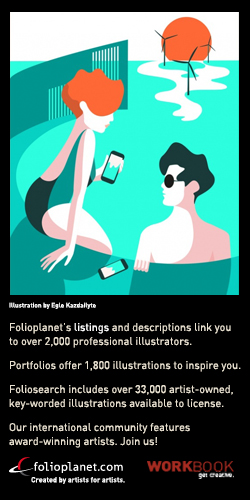
Kazdailyte, Egle
Professionally trained as an architect it is no surprise that Egle has since moved on to the colourful world illustration….in fact we can attest to that, as when we met, she was a wave of complimentary hues! Over the last ten years she has created illustrations and visual language for multiple companies from well established names like The Guardian to successful startups such as Lyst. Over the years she has developed a wide range of styles and techniques. Having travelled extensively; Singapore, Shanghai, Mumbai, New York, London and Copenhagen has allowed her to develop both a deep understanding of visual styles and a wide cultural language when working with international clients all over the world. She translates ideas into shapes and colours.
Holmes, Stuart
Londoner Stuart Holmes is now based in Australia’s creative enclave of Melbourne. Trained as a graphic designer, he felt that illustration allowed him much more freedom, and he developed a flat vector style that has remained popular for well over a decade.
Stuart is addicted to vinyl and wherever he goes seeks out a record crate to dig through. He’s also a huge fan of Southampton FC, and led the team out as a mascot back when he was seven years old.
Stuart is addicted to vinyl and wherever he goes seeks out a record crate to dig through. He’s also a huge fan of Southampton FC, and led the team out as a mascot back when he was seven years old.
Billy, Butcher
Butcher Billy is a Brazilian illustrator with a fresh approach, who loves to slice up ideas and imagery in popular culture and reassemble them in unique ways. Juxtaposing everything from Wonder Woman and the Watchmen to Morrissey and Breaking Bad, his work is ironic, humorous and very postmodern. His subtle questioning of pop culture using pop art as his medium is a juxtaposition in itself, yet in their own unique way all his images seem to make sense.
In addition to his illustration work, Billy is a creative director in a digital agency. He lived in the UK for a while, and has travelled widely. With seemingly endless influences at his disposal – including Banksy, Steve Ditko, Shigeru Miyamoto, Malcolm McLaren and Andy Warhol - Butcher Billy never runs out of moods and concepts to explore.
“I like to create freely and then realise bits of an artwork are influenced by the mood of a movie by Tim Burton, the brushstrokes of a piece by Salvador Dali, with a soundtrack from an early album by David Bowie,” he says.
Cooper, Dena
Soft and skilfully painted, Dena Cooper’s fashion illustrations also offer moments of striking contrast and intensity. Her lifelike models look as they could walk right off the page and join in with your conversation.
With a background in fashion design, Dena is now a leading New York illustrator with a growing list of industry clients. Transplanted into Brooklyn from Fredricksburg, Virginia, she loves New York and Fashion Week in particular. “I’m very influenced by street style that I see around the city, specifically the effortless chic that so many New Yorkers exude walking down the street.”
Further inspiration comes from designers like Marchesa, Dior, Delpozo, and Viktor & Rolf, but Dena also loves reading, running, a good cup of coffee or a glass of wine.
Arnett, Sarah
Sarah Arnett’s beautiful work is renowned for its colourful nature-inspired prints. Sarah’s love of gardening and botanical gardens is key to her work. Studying and interpreting flowers, foliage, land & skyscapes are the starting point of any project. Throughout her work you will find recurring tree motifs to delicate abstract patterns inspired by butterflies and tropical plants, a real visual treat. Sarah’s illustrations develop from the hand-drawn and are then digitally illustrated. Not only a fabulous illustrator and print designer, she also runs her own clothing label and makes beautiful dresses and printed textiles. What excites her the most, is colour, “It’s my real passion”.
Crush
Crush is a truly integrated design agency providing creative solutions across all print, digital and moving media. We believe in a collaborative creative process and intelligent idea generation. We’re passionate about our work and famed for producing standout creative for clients all over the world. We don’t just want to simply make stuff look good, we want to make smart ideas look great.
Javens, Ben
Ben grew up in a small town in Yorkshire and though he now resides in Birmingham he still holds dear those formative years and his northern roots. Those that know Ben will no doubt tell you he can be a bit of a curmudgeon but that deep down there is a happy soul trying to get out and those that know his work will no doubt see the battle between happy and sad in the characters he draws and the situations they find themselves in. Ben's work is often very simple but always displays a strong emphasis on colour and a carefully considered composition. He takes much of his inspiration from the books he collects about illustrators and designers from the mid 20th century and those of new artists’ that give a nod to past styles and trends. He also fills his working days with music so as to let it seep into his soul and be transformed into something that can be seen.
Eason, Rohan
London based Illustrator Rohan Eason works predominantly in pen and ink. He is best known for his stark black and white imagery, which plays heavily on the roles of composition and view point, and the balance between intricate detail and dark or light space.
His work has become widely used in book illustration and more recently in advertising, where his uniquely hand crafted style stands apart from the more typically used digital art forms.
Although art has run very clearly through his family and his childhood, it was only after leaving university and a painting degree that he decided to pursue illustration as his preferred discipline. Rohan loved the work of Aubrey Beardsley and Arthur Rackham as a boy, and this devotion to and pursuit of the beautifully hand drawn line followed him into adulthood. His portfolio now bursts with the magical and fantastical scenes from dreams to nightmares, from real life to imagined creations, but all with the same single grounding fact, that of beauty and balance.
Although art has run very clearly through his family and his childhood, it was only after leaving university and a painting degree that he decided to pursue illustration as his preferred discipline. Rohan loved the work of Aubrey Beardsley and Arthur Rackham as a boy, and this devotion to and pursuit of the beautifully hand drawn line followed him into adulthood. His portfolio now bursts with the magical and fantastical scenes from dreams to nightmares, from real life to imagined creations, but all with the same single grounding fact, that of beauty and balance.
Taylor, Nadia
Nadia Taylor is a designer and printmaker based in London. Her colourful prints are filled with bold shapes and striking pattern. She loves screen-printing and the whole process informs her work – from the use of a limited colour palette to the incorporation of textures and dark outlines. Her work projects range from large-scale hand-painted murals, packaing, book covers, greeting cards, gift wrap, menus and farm signs with a list of clients including Ikea, Target, Mr Kipling, and Zizzi Restaurants.
Barber, Isobel
Isobel is a paper engineer and illustrator, living and working in the beautiful county of Dorset. Isobel graduated from the Arts University Bournemouth in 2012 with a degree in Textile design, where she specialised in creating illustrative patterns and print designs using a cut paper technique. Isobel continues to use this method to create detailed work and miniature sets, using layers of card and cut paper. Isobel has worked with a number of clients in fields such as advertising, editorial, branding, live illustration events and most recently film. Clients include The National Trust, Tesco, Lands' End, Harveys Furniture, Benson for Beds & Wilderness Festival. When not wielding a pair of scissors or a scalpel, some of her other pastimes include baking, prising scraps of stray paper from the jaws of her miniature schnauzer Otto, running along the Dorset coast, flowers and photographing colourful things.
Sulzberg, Daniel
Illustrator Daniel Sulzberg is based in Santa Barbara, California, and his work is infused with the easy-going creativity that his home state is famous for. It’s colourful and fun, welcoming and sometimes a little bit zany. Maybe that’s why the characters he draws so effortlessly seem to jump to life in his illustrations.
Growing up in a town called Danville, he was always Dan from Danville. After initially trying to emulate his older brother, who was a fine artist, Dan later discovered cartoons, comics and Nintendo games. Soon, he had invented Danvillage, a place for all his whimsical characters to inhabit. It’s become the moniker he works under as an illustrator.
Dan’s favourite artists include Dali, Murakami and Miyazaki, while Prince and Reggae music keep him juiced up on tunes. He also has a huge collection of 80s vinyl from his days as a DJ.
Brickley, Corey
Corey has been announced Merit Winner of the 3x3 Professional Show, reproduced in the 3x3 Illustration Annual No.13.
Corey Brickley was born in the U.S. In 1987 and now lives and works as an illustrator and designer in Philadelphia.
Corey Brickley is a graduate of the University of the Arts' Illustration program in Philadelphia, PA. Corey creates concept-driven illustrations for editorial, publishing, music and advertising. He is a digital artist who uses a healthy mix of 3D, texture, and Wacom-based painting. His work is concerned with surreal and graphic juxtapositions.
Corey primarily works in editorial and specializes in motion graphics and animation. Corey is a winner of the American Illustration 35th annual competition for his motion illustration work with The Huffington Post.
Previous clients include: The New Yorker, The New York Times, The Huffington Post, Pacific Standard Magazine, Vice Magazine, Penn Gazette, Texas Monthly, Magnet Magazine, Grid Magazine.
Dream clients: Mother Jones, Popular Mechanics, GQ, Rolling Stone, Penguin, Little Brown, Tor, Converse, Vans, MTV, SmuttyNose Brewing Co
Malbon, Chris
Based in beautiful Bristol, Chris Malbon, AKA Melb is an active member of the area’s thriving art and design scene, regularly giving talks at local colleges and universities. He classes himself as a creative all-rounder, comfortable designing and illustrating from the side of matchboxes to large murals, be it in pencil, pen, paint or pixel, he’s happy using them all.
Incredibly experienced and versatile, Chris is able to adapt his style and creative process to fit the demands of the job in hand, this ability makes Chris a winner for any campaign large or small. The end result is always of the highest quality both artistically and commercially. He is constantly figuring out innovative new concepts and ideas to push his art.
A hardworking and prolific contributor, Chris has created work for an array of clients and agencies over the past 15 years. He has worked on campaigns for Coca-Cola, Sony, London 2012, Unilever, Carhartt, Nestle, Nike and MTV and has plenty more impressive credits under his belt, so he is no stranger to the pressure that comes from working on high-profile campaigns.
His career has taken him on a journey through some renowned studios including Attik, Zip Design, Version, Sun House and McFaul Studio.
Client List: Nike, Lucas Films, Coke Olympics 2012, Bristol City College, BBC, Discovery Channel, Hero Complex Gallery, Gallery1988, Aardman, Mondays MoCo, Lounger Productions, Clutter Magazine, Digicel, Computer Arts Magazine, AnyForty, EA Games, Hugo Boss x Martin Kaymer, Henrik Stenson, Nesspresso, David Guetta, Orange / EE, Clearasil, Design Council, Shortlist Magazine, Vintage TV, Mauger Modern, Luma, KIA, DJ Magazine, The Economic Review
Fuentes, Edu
Born in Madrid and currently based in London, Edu Fuentes has been working as a freelance illustrator since 2003, combining a wide range of commercial projects with personal work and exhibitions.
With a combination of bold colours and geometry, his artwork orbits between the symbolic and the mechanical, playing with depth of field and multilayered objects. He is inspired by science, cinema and pop culture, and makes a sisyphean attempt to learn Japanese every once in a while.
His work has been featured in the books Understanding Illustration, Ghosts of Gone Birds and Three By Three Illustration Directory.
Previous clients include: Wired UK, Mayor of London, BMW, Zurich, More Than, Monocle, Times Higher Education, GT Nexus, Kaplan, WPP, Financial Management, Bulletin, STEP Journal, FM World, WeAreBold, Oxford University Press.
Schommer, Florian
Berlin based Art Director and Designer working within branding, illustration, editorial design, packaging design and contemporary art. Dividing his time between personal projects and working with a variety of international clients like Sony Music, Penguin Classics, Swatch, The Guardian, Brew Dog, Jura Whisky, The Economist, Columbia Records, JP Morgan & Chase, Skoda, Jägermeister and many more.
Florian performs his own recognizable style, while also being able to adapt to his customers’ preferences. Growing up in the skate & punk scene of the 90s, he later attended art college in Düsseldorf while constantly touring the world with a variety of bands. After winning several Design awards like ADC, German Design Awards, Illustrative Nominee and Red Dot Award he became an official member of Germany’s Art Directors Club.
Florian performs his own recognizable style, while also being able to adapt to his customers’ preferences. Growing up in the skate & punk scene of the 90s, he later attended art college in Düsseldorf while constantly touring the world with a variety of bands. After winning several Design awards like ADC, German Design Awards, Illustrative Nominee and Red Dot Award he became an official member of Germany’s Art Directors Club.
Horvath, Peter
Peter Horvath, born of Hungarian descent into a lineage of photographers, began taking pictures at age 6. After spending his formative years inhaling darkroom fumes, he worked as a stills photographer until he discovered computers in 1995 when a friend gave him a Macintosh Plus. Shortly thereafter, he happened across the work of Dadaists John Heartfield and Hannah Hoch, whose work exposed him to the world of photo-montage. He has since produced digital collage works exploring narrative, abstraction, and the hypnagogic, and continues to push the boundaries of convention, displacing the familiar and nostalgic with unique, surreal touches. Peter’s ability to master bold compositions that convey complex concepts is what makes his work stand out. His impactful images make him a natural choice for the nuances of editorial work, and the call-to-action needs of advertising. His work is featured in the newly published book from Die Gestalten, "Illusive - Contemporary Illustration", as well as an upcoming book on collage.
Previous commercial clients include The Economist's Intelligent Life Magazine, AMEX, The Washington Post, The Smithsonian Magazine, Billboard Magazine, The Atlantic Monthly, Wired Magazine, Entertainment Weekly, The Wall Street Journal, Forbes Magazine, The Village Voice, Variety, Scientific American Mind Magazine, New York Times, The L.A. Times and L.A Weekly among others.
Peter has been awarded numerous grants from The Canada Council for the Arts for his new media work, and is the recipient of commissions from Rhizome.org at The New Museum, NYC (2005) and Turbulence.org New Radio and Performing Arts, Boston (2004). He has exhibited in museums and galleries across the globe including the Whitney Museum Of American Art‘s Artport (NYC), Museo Tamayo Arte Contemporaneo (Mexico City), the Musee national des beaux-arts du Quebec (Quebec City, Canada) and FILE Electronic Language International Festival (Sao Paulo, Brazil).
Loeffler, Max
Max was born in rural Germany in 1989 and started out illustrating extensive album artworks for punk and metal bands after doing his homework. After graduating from the Graphic Design department at Hochschule Darmstadt in 2017, he began working as a freelancer with renowned clients like The New Yorker, The New York Times, Adidas and Google. He still enjoys creating artwork for bands.
Influenced by the classic surrealists as well as retro science-fiction book covers, he likes to look below the surface of one-to-one visual translations, adding meaning and room for inference by wrapping his illustrations in the dense atmosphere of a surreal and melancholic parallel universe. His urge is to translate and decipher what can only be felt, not directly seen, and to amplify this visually, particularly in his personal work.
Max has worked with clients such as: The New Yorker , The New York Times , Google, GLOBE Brand, Future Islands, Bloomberg Businessweek, Folio Society, Atreyu, GQ Magazine, WirtschaftsWoche, DIE ZEIT, Adidas, Bandcamp, Medium, Cicero, The Economist, Variety, Wall Street Journal, The Hollywood Reporter, and The Shrine.
Awards: 2019: 3x3 AWARD SHOW Merit 2019: WORLD ILLUSTRATION AWARDS 2x Shortlist 2019: AMERICAN ILLUSTRATION 38 Winner 2019: SOCIETY OF ILLUSTRATORS “Illustrators 61” Exhibit & book 2018: JOSEPH BINDER AWARD Distinction 2018: GERMAN DESIGN AWARD Newcomer Nominee 2018: FOLIO SOCIETY BOOK COMPETITION Winner 2017: 3x3 STUDENT SHOW Gold 2016: JOSEPH BINDER AWARD Distinction 2016: ADC GERMANY Silver
Books: Lürzer’s 200 Best Illustrators 2018/2019 Freistil
Wolski, Marcin
Marcin Wolski is an illustrator and graphic designer with several years of experience in advertising, and editorial illustration. He began his artistic journey with traditional media, slowly moving to digital art. He lives and works in Sopot, Poland.
In his illustrations, Marcin tries to capture specific mood using simple shapes, colour and light to distill the essence of the story that he tries to tell in each illustration. His inspirations come from retro games and Polish socialist-era posters as well as modern illustration.
In his illustrations, Marcin tries to capture specific mood using simple shapes, colour and light to distill the essence of the story that he tries to tell in each illustration. His inspirations come from retro games and Polish socialist-era posters as well as modern illustration.
BloodBros.
BloodBros. is the studio of New Zealand-born illustrator and graphic artist Emile Holmewood, who currently lives in Tokyo.
Originally a graphic designer, he was once told by a studio creative director to remember he is a "graphic designer who illustrates, and not the other way around", Emile has since worked tirelessly to prove otherwise, bringing his artistic flair to everything he does.
Nevertheless, Emile’s unique style is underpinned by graphic design principles, and contradiction is central to his work: he constructs his illustrations in cold-hearted vectors, then warms them up with playful colours, a heavy dose of humour and sometimes; animation.
Emile's inspiration comes from a vast array of eclectic sources including LEGO, life in Japan, fish, baroque paintings, bubblegum and The Simpsons – to name but a few.
Some previous clients include:
The Sunday Times, Bank of America, Apple, IBM, The Verge, 99 percent invisible (podcast), La Quinta Hotels, IEEE, Radio New Zealand, Seamless, Exxon Mobil, Toshiba, Marketing Week and Bank West
Awards
2015 Best Awards Finalist 2013 Best Awards Silver, Bronze, Finalist, Finalist 2012 Best Awards Finalist 2011 Graphis Platinum 2009 Best Awards Finalist 2008 Best Awards Silver
Oliver, Mark
Experienced and versatile, Mark Oliver has a bold, graphical style that is as impactful as it is engaging. His line work, color and compositional skills are second to none, and his background in advertising means he knows exactly how to meet an art director’s brief with innovative new approaches.
Even when he worked at Alliance International, Mark took the opportunity to illustrate his own ads. With over 20 years under his belt as a freelance illustrator, today he creates imagery for some of the biggest brands and top names in publishing. Now based in Worthing on the South Coast, he’s inspired by Raymond Loewy, Hergé and Eduardo Paolozzi. Mark has a degree in Graphic Design from Middlesex University.
APPROACH
Mark has used a wide range of media during his career, from physical painting and collage through to Illustrator and Photoshop. Most projects these days are tackled digitally, but he loves to draw and paint as well if it suits the commission.
STYLES
Mark works in a variety of styles that he adapts to suit the requirements of a job. His favorite at the moment involves an isometric perspective, geometric shapes and a distressed finish with a retro palette.
CLIENT LIST
Mark’s impressive client list includes Macmillan, Visa, Toyota, Volkswagen, The Times, Punch, Faber & Faber, Penguin Books, Macmillan, Bloomsbury, OUP and British Gas.
Tallon, Ben
Loud, lively, frenetic and expressive, Ben Tallon’s artwork captures the many moods of modern life thanks to his instinctive drawing style and ample splashes of ink, brush marks and scribbles. His ability to organize chaotic creativity and turn it into a captivating image is exactly what his clients want.
Growing up in Keighley, West Yorkshire, Ben loved Leeds United, wrestling and video games as a child. They still give him inspiration today, and sometimes feature in his work, alongside pop icons and TV stars. Now located in London, Ben is passionate about creativity and is the author of Champagne and Wax Crayons, as well as the host of the podcast Arrest All Mimics. He has a BTEC in Graphic Design from Keighley College, and a BA in Illustration from the University of Central Lancashire.
APPROACH
Pens, inks, brushes, found materials and textures, acrylics, spray paint, pastels, wax and colored pencils – Ben is very much a mixed media creative. He’ll use worn out old brushes that have a little more depth and character than new ones, and favors the unexpected or happy accident. Photoshop is used to layer everything together and finalize the composition.
STYLE
Ben’s style is loose and organic, full of marks and gaps because he likes to engage viewers by leaving something to the imagination.
AWARDS
2015 – Dot London Small Business Awards – Creative Agency of the Year
CLIENT LIST
Ben has been commissioned by clients including The Guardian, EasyJet, Adidas, World Wrestling Entertainment, Comic Relief, Channel 4, The Wall Street Journal, UNICEF and more.
Tallon Type
Often, custom lettering is just what a project needs to make it completely unique while at the same time hitting the perfect note with its intended audience. And when a project like that comes along, Ben Tallon’s bespoke hand lettering service Tallon Type should come at the top of your list. Here’s an artist who can tailor the text not just to the campaign but to each individual communication with in it at a level of detail that script typefaces just can’t match.
From tight handwritten styles through to headlines in broad brushstrokes, Ben will fine-tune the lettering to the job at hand. He’s spent years evolving a range of character styles, working closely with art directors to gain a comprehensive understanding of kerning, weight, messaging hierarchies, composition and overlays to make custom lettering as effective as possible.
APPROACH
When Ben receives a brief he often collaborates closely with his client in choosing the media and execution that will give the project maximum impact. Inks, paints, spray paint, pencils, pens and found materials – the selection depends on the surface, idea, photography and time constraints.
STYLES
Ben creates hand lettering in a variety of styles, and will find a look to perfectly suit the mood and tone of the brief. For one project pen work in a clear hand will convey the right level of subtlety, while others need enormous, bright spray-painted caps. Ben can deliver either, and anything in between.
CLIENT LIST
Tallon Type clients include The Premier League, World Wrestling Entertainment, Arsenal Football Club, The Guardian, Bloomsbury, Women’s Health, Dr Martens and Comic Relief.
Venables, Bob
Bob Venables is the go-to illustrator for any project that requires illustrations executed in a classic style. Matisse, Hogarth, Wyeth, Rackham, Lowbrow… whatever look you’re after, Bob will deliver. He’s a pastiche illustrator par excellence.
Bob has worked on many high profile advertising campaigns, including the Profit Hunter ads for Artemis, which have run for over a decade. His versatility, eye for detail, and ability to evoke the past while conveying contemporary themes to contemporary audiences are what keep clients coming back again and again. Originally from Birmingham, Bob worked in London and established himself on the advertising scene before moving to the Isle of Wight, where life is a little more relaxed. He studied Graphic Design at Central Saint Martins gaining a BA, and did archaeological illustration for a year before becoming a freelancer.
APPROACH
Bob works in a whole range of media, depending on what’s required by the commission. On the traditional side he uses oil, acrylic, alkyd, watercolor, and pen and ink, but he’s also happy working digitally on his Wacom Cintiq.
STYLES
Primarily a pastiche illustrator, Bob is adept at recreating just about any look – from 1930s propaganda-style posters to old maps, and from neoclassical still lifes to jolly 19th century book illustrations.
CLIENT LIST
Bob works for a range of top-flight clients including Guinness, British Airways, Artemis Asset Management, the BBC, Adidas, Sony, Heinz, Tesco, Waitrose, John Smiths, FIFA, VW, BMW and the Folio Society.
Patra, Jyotirmayee
Jyotirmayee Patra – also known as JP – is India’s leading artist for custom lettering, playfully embellished with beautifully rendered flowers, intriguing animals, graphic shapes and lively textures.
Based in Rourkela, JP’s passion for calligraphy has led to a career in illustrative lettering, using her talent to imbue her clients’ projects with tone and atmosphere. Botanical drawings and organic patterns are two of her main inspirations, alongside the abstract artist Jessi Raulet. She studied at India’s National Institute of Design in Ahmedabad, learned professional calligraphy from Harvest Crittenden, and has taught copperplate calligraphy workshops. JP is a hoarder of unique stationery and pens, loves fairy lights and is a yoga practitioner with an interest in cosmic energy, astral projection and conscious manifestation. “Joining IllustrationWeb was one of my manifestation goals not so long ago, so I believe I have decent manifestation skills!” she says.
APPROACH
Everything begins with an inspiring quote, copy relating to the brief, or a central image. After refining her focal point, JP surrounds it with detailed flowers, characters and foliage, playing with the composition until it’s perfectly balanced.
STYLES
JP’s type and illustrations are infused with nature, with bold main forms softened by whimsical detail. While her earlier type-based work is black and white and emphasizes her rendering skills, her latest images pop with color.
AWARDS
Winner – INDIAFRICA: A Shared Future Poster Awards – 2012
CLIENT LIST
JP’s client list includes Snapchat, Makemytrip, DesignUp, Asian Paints, St+Art India, Levi's, Snap-on Incorporated, Design Stack, Bakheda, IxIDEAS Consulting, AGoodFeeling and Hornet Inc.
Wue, Decue
Decue Wu has clients in editorial, fashion and publishing who all love her illustration work for its bold style, bright colors, optimistic vibe and the intriguing way she combines patterns and textures. She gives every project a classic illustration feel, with the hand of the artist always present.
Based in Boston, Decue is originally from China and works for clients all round the world. Fashion is one of her biggest inspirations and her favorite designers include Yves St Laurent, Helmut Lang, Hussein Chalayan, Alexander McQueen and Rei Kawakubo. “To me, their designs are fine art and bring fashion to a whole new level in the history of art,” she says. She has an MFA in Illustration Practice from the Maryland Institute College of Art, and previously studied Digital Media Art at Zhejiang University in China.
APPROACH
Most of Decue’s work is done using Photoshop and Illustrator, but she also combines hand-made textures, screenprinting and collage work to give her illustrations something extra.
STYLES
Decue’s fashion images often feature long, thin figures in a freehand style and vibrant colors. Her lifestyle illustrations usually have a more restrained palette, geometric shapes and patterns, and interesting brush and paper textures. She also creates graphic art and infographics, going for a cleaner look, using simple vector shapes and geometric forms.
AWARDS
2014 Hiii Illustration Merit 2014 Taipei Art Competition Winner
CLIENT LIST
Some of Decue’s clients include Vogue, Airbnb, Esquire, MIT, Modern Weekly China, Obscura Magazine, The Bump, Draw A Dot and Hopes and Fears.