


Home : Food & Beverage : Page 2
Harrison, Shane
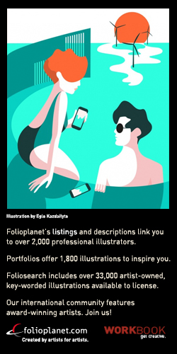
Deco meets Disco. Charming and unusual illustration.
A mix of modern and retro elements.
Watson, Laura
Fun, fresh illustrations of loopy kids, cuddly animals and wondrous places... created in acrylic paint and digital collage, with a retro twist and often featuring custom vintage hand lettering. Specialties are children's books and food illustration.
Zafman, Randi
Randi is an illustrator and designer who creates hand painted watercolor illustrations and lettering. She earned a BA in fine art and went on to a career in graphic design, art direction and giftware design. Randi was born and raised in Los Angeles where she still lives today. Her bright colors, bold graphics and funky geometrics are inspired by mid century modern design and her California lifestyle.
Scott, Si
Since its inception in 2006 by Si Scott, its original founder and Creative Director, Si Scott Studio Ltd. has established an internationally recognized reputation for providing unique creative concepts and imagery for a prestigious and ever-growing client list.
Si’s love of music inspires the flowing nature of his hand-drawn designs, beautifully and precisely executed. He resists limitations in his own work, constantly exploring new techniques. These explorations have led to his development as a paper-cut and tattoo artist, skills which complement his already established talents as a proficient draughtsman. Si’s multi-faceted approach has led him to work across a wide spectrum of projects, from advertising campaigns to branding, publishing to editorial, and interior design to album covers.
Outside of his creative practice Si exhibits his work frequently, offers both art direction and creative consultation to clients, and gives lectures on both his experience as an artist and his knowledge of the industry. His work has been regularly awarded and featured in numerous publications, including being listed in the Best 200 Design Moments Ever by Computer Arts Magazine, and honoured twice in Luerzer's Archive - The Best 200 Illustrators In The World.
Foster, Jeff
Raised on a wheat farm in Montana.
Traveled to Portland Oregon.
Schooled at Pacific Northwest College of Art.
8 year stint at W+K.
Freelancing and living large in the Northwest.
Good with photoshop, illustrator and a no.2 pencil.
Walsh, Sarah
Sarah Walsh is an internationally published illustrator who's project range spans from picture books, apparel, home decor and greeting cards to name a few. Her work has also been featured on Creative Pep Talk, Buzzfeed & The Jealous Curator. Sarah has been a working artist since 2001, starting out as a designer/illustrator hybrid at Hallmark Cards in Kansas City. In 2013 she branched off solo style into the freelance world after connecting with an art agent named Lilla Rogers. Bright color, fashion, mid century design, the 80's, fantasy, hand lettering, world culture & folk art art are some of the elements that inform her work.
Writing and illustrating a children's book or working with a fashion designer to create a quirky haute couture clothing line are two of her dream projects! When Sarah isn't busy doing client work she fills her sketchbook with personal paintings or creates products such as art prints, enamel pins & pillows for Tigersheep Friends, with her husband Colin Walsh, a fellow illustrator.
Writing and illustrating a children's book or working with a fashion designer to create a quirky haute couture clothing line are two of her dream projects! When Sarah isn't busy doing client work she fills her sketchbook with personal paintings or creates products such as art prints, enamel pins & pillows for Tigersheep Friends, with her husband Colin Walsh, a fellow illustrator.
Reed Silver, Judy
Judy Reed Silver's style focuses on an eclectic collage of illustration, design, photography, vintage and modern. She has been inspired by nature, vintage fabrics and silk Japanese kimonos, how they can be applied to surface design from rugs, stationary, shoes, T-shirts, tableware, bags, product packaging, store displays, posters, wall décor and how art as design can apply to our everyday living environment.
Judy creates for such clients as Sherwin-Williams, Disney, U.S.P.S., Emory University, Publix and The Natural History Museum of Los Angeles. She has illustrated children's books and cookbooks for Chronicle Books and Simon & Schuster/Silver Burdett & Ginn. Her editorial clients range from Newsweek, Boston Globe, Bon Appetit, New England Journal of Medicine. She has exhibited in several one woman shows and national group shows of mono-types, giclee prints and illustrations, featured in Communication Arts Annual, The Society of Publication Designers Best Spot Illustrations & Brochures, Visions Magazine, How's Promotional Design Annual, Stir Magazine, and Taxi Design. She received her BFA from Art Center College of Design in Pasadena.
Haake, Martin
Martin Haake is an internationally known illustrator and artist. After some years living in London, Martin moved back to Berlin where he lives with his wife and his two sons who both want to grow up to be pirates!(the old fashioned kind of course). He has been working as a freelance illustrator for about 14 years for clients all over the world: Barnes & Noble, The Royal Society of Arts, Penguin Books, The Boston Globe, Travel & Leisure, Elle and the Shangri-la Hotel, Hongkong to name a few. Martin Haake's work has been selected for many illustration and design annuals. He is a big fan of American Folk art and is collecting telephone doodles.
Larsen, Eric
TO SEE THE COMPLETE IMAGES---HIT ERIC'S HOMEPAGE URL (above). That said, Eric Larsen has been a working, multiple-style illustrator since the year John Lennon was shot. That's a long time. He's worked for a lot of really good people for a really long time too. Clients include: DDB Chicago, CMD Agency, Daimler-Western Star Trucks, The Amelie Company, Colorado DOT, Three Communications Chicago, The Great Society, Cengage, Pearson Learning, This Old House, California Magazine, AAA Traveler Magazine, Westways Magazine, Scholastic, J.Walter Thompson, Hachette Books, Guideposts Magazine and many more.
Please hit his website link to see more of his stuff. We really hope you don't hate it you've got so many choices.
Keywords: automotive, truck, car, industry, industrial, retro,digital, pencil, airbrush, digital, vector, multiple_style,texture, engines, train, travel, tourism, feminine, masculine, machine, character development, cartoon, comic, medical, hospital, science, food, product, line _over_color, editorial, realism, stylized, style-match, food, beverage,tee_shirt, business, corporate, financial, graphic, postcard, scenic, hand_lettering
Liz Sanders Agency
Since 1985, Liz Sanders Agency has represented an eclectic group of commercial illustrators, each highly specialized in a range of medium: digital, oil, acrylic, pastel and a variety of style: realistic, whimsical, editorial, juvenile. My commitment to personal service and positive relationships has proven well in seeking out the best of art buyers and freshest, most unique talent. My business philosophy is founded on reliability, honesty, practicality and persistence. These attributes combined with effective marketing & promotion has resulted in a thriving business whose client base includes design/advertising firms, magazine/book publishers, and corporations.
Rosenbaum, Jonathan & Georgina
Jonathan and Georgina Rosenbaum have been two of the premier food and beverage illustrators since the early 90s working with clients as diverse as Pepsi, Seagram’s, Nestle, Kraft, Gillette, Pfizer and Orville Redenbacher. During the days of conventional airbrush they worked as a team creating different aspects of an illustration. Making the transition to digital in the mid- 90s enabled the Rosenbaums to improve both consistency and timing over a product line. This made them a sort of super illustrator, perhaps a major movie deal is in the wings?
Multiple piece projects are a specialty, such as a recent 600+ illustration packaging assignment for a national supermarket brand, 75 illustrations for a national pharmacy chain and 30 illustrations for a private label group. Subjects included fruit, vegetables, candy, chocolate, desserts, drinks, juice, water, splashes, and pours.This is in addition to a number of smaller, but no less important, projects for loyal clients who will only accept the Rosenbaum's style and quality, a Herculean effort and one that would not have been possible had they not been a team.
Salerno, Steven
NYC based illustrator Steven Salerno creates stylized illustrations ranging from graphically simple and whimsical, to more realistic and richly textured imagery with some also having a retro feel. All are anchored in traditional drawing skills reflective of his admiration for select artists and illustrators from past eras.
Over his long independent graphics career Steven has created thousands of published illustrations for nearly 600 clients, for use in print & web advertising, editorial magazines and newspapers, product packaging, corporate publications, retail graphics, and publishing.
To date Steven has also illustrated 36 popular picture books for children, with 5 of these titles as both author and illustrator. His most recent author/illustrator picture book title is "Tim's Goodbye," published by Farrar Straus Giroux 2018, the gentle story of Margot and friends gathering to give their heartfelt impromptu goodbye to a beloved pet that has died.
UPDATE: Steven has illustrated the upcoming wonderful nonfiction picture book, "On the Corner of Chocolate Avenue -How Milton Hershey Brought Milk Chocolate To America" -written by Tziporah Cohen & illustrated by Steven Salerno, to be released by Clarion Books/Harper Collins in December 2022. It’s the life story of American Milton Hershey, the poor kid from Pennsylvania who built his company, HERSHEY’S, into one of the largest manufacturers of chocolate in the world. "On the Corner of Chocolate Avenue" is a Junior Library Guild GOLD STANDARD Selection for 2022.
Some of Steven's picture books have been translated into Chinese, German, Korean, Japanese, Arabic, and Spanish. His picture books have received industry starred reviews from Publishers Weekly, Kirkus Reviews, School Library Journal, Children's Literature, The New York Times Review of Books, and have been displayed by the Society of Illustrators (NYC) in their annual children's picture book art exhibition, The Original Art. Steven's illustrations have been recognized for excellence by Communication Arts, Print, Society for News Design, Society of Publication Designers, The Art Director's Club, Society of Illustrators, and the Junior Library Guild.
Originally from Vermont, Steven was an honors graduate of the Illustration Department at Parsons School of Design in New York City, where he studied art history, printmaking, animation, and illustration under top industry professionals including famed author/illustrator Maurice Sendak, of the ground breaking picture book "Where the Wild Things Are." Steven is primarily engaged with illustrating and writing picture books for kids, but also still creates illustrations for clients in advertising, magazines, newspapers, corporate publications, and product packaging.
Visit Steven’s illustration blog
O'Kif, Alejandro
Alejandro Okif lives in Buenos Aires with his creative family, his wife Monica (illustrator), son Sebastian (musician) and daughter, Simona (illustrator and tattoo artist). As a young boy, his father who worked in advertising introduced him to the arts. As a result, he was totally hooked and started drawing immediately. When he was at Facultad de Humanidades y Artes de Rosario, he was drawn to Egon Schiele, Rembrandt, Goya, and Lautrec. As he started working in publishing, he discovered the talented work of some amazing illustrators such as Andre Francois, Quentin Blake, Ronald Searle, and Tomi Ungerer. Alejandro works with different mediums, from acrylics, watercolors, inks, and Photoshop. When not illustrating, he enjoys watching movies, going to concerts, and playing bass guitar with his son Sebastian(though he claims that he is not a good musician).
Lyons, Chris
Chris Lyons is an Illustrator, gardener, and pass-first point guard. And hopelessly addicted to all three things. He loves to do great work for great clients. In the last few months that’s been: Conde Nast Traveler, American Express, Target, Penguin Publishing, Chicago Magazine, Monocle Magazine (London), Scholastic, Chicago Tribune, McCann Erickson, LA Magazine, Cramer-Kressalt, AirTran, Smart Money, Utne Reader, The New York Times, Bicycling Magazine, Texas Monthly and AARP to name a few. His work has appeared with some regularity in the CA Illustration Annual, American Illustration, 3x3 and Creative Quarterly. He is also on the Adjunct Faculty of The School of Design at RIT.
Lund, Jon C.
Classic vintage poster style digital art Influenced by everything from travel posters to matchbooks
and inspired by some of the great commercial artists of the first half of the last century.
Specializing in posters, covers, logos, and lettering for advertising, sales promotion and licensing.
Clients include: The NFL, Disney, PGA, Pepsi, Apple computer, Target, Hasbro, The USGA
Yum Brands, Ghirardelli, ESPN, Parker Bros., Major League Baseball, Wall St. Journal,
Wall Mart, TravelSmith, Bacardi, Wizards of the Coast, Starbucks. .
Classic poster style illustration and typography
Haight, Sandy
Stylized, calligraphic vector or brush & ink line art with vibrant watercolor tones for elegant, contemporary images on logos, icons, spots and concept illustrations seen on advertising, book jackets, magazines, product packaging and across the web.See also http://sandyhaightfineart.com.
Garland, Paul
Paul Garland was born in Somerset, England. Studied at Somerset College of Arts & Technology, Epsom School of Art and Plymouth University and currently works from his studio in the North of England.
The images begin life with confident pencil drawings. These are then combined with handmade textures, painting, and printmaking to complete, vibrant digital imagery which allows for the works to be commissioned from and to anywhere in the world. His works often use metaphors to convey the brief in as simple and effective a way as possible.
His work has been recognised by the Society of Illustrators, American Illustration, 3x3, Luerzers Archive, Society of Illustrators of LA, the Association of Illustrators and the World Illustration Awards amongst others.
Follow me on Instagram!
Hargreaves, Martin
History and humor marry together beautifully in the illustrations of Martin Hargreaves, and his versatile style has seen him creating everything from pastiche images mimicking the great masters to fantastical beasts and still life paintings. You’ll find his work in advertising, children’s books, magazines and newspapers, and even at Hampton Court Palace.
It’s no surprise to learn that Martin’s greatest inspiration comes from classical painters like William Hogarth, Hans Holbein, Rembrandt and Giovanni Battista Piazzetta. In fact, he says that if he could travel back in time he would visit the 18th century, and alongside his love of Renaissance artwork he also loves classical music.
Martin works from a shed in his garden, with large windows through which he can see apple trees and the rolling hills of East Sussex. If he ever gets creative block, he likes to dig in his vegetable garden, or look after his many pets, which include two dogs, three horses, two guinea pigs and seven chickens.
Martin has a BA Illustration from Brighton Polytechnic (now Brighton University).
His approach and the media he uses vary from project to project, but he always begins drawing with a simple pen on paper until he has an idea of what direction the image will take. Martin works in traditional media – oil paints, watercolor, pen and ink – and is also adept at making changes digitally as required. The 2B pencil is his all-time favorite art tool.
Martin’s inspiration comes from the old masters, and the styles he works in follow on from that. In his portfolio you’ll see fine paintings that look just like Rembrandts, and others that are more like 18th century engravings or 19th century book illustrations. In short, he will come up with a style that suits the brief.
Gu, Sunny
Based in sunny Los Angeles, Sunny Gu is an artist who’s curious about culture. She loves to look for beauty in everything around her and then recreate it in her art. It certainly shows through in her work, which is full of colour, glamour, fashion and ornamentation.
Sunny was born in China but emigrated to the US when she was 13. She’s loved drawing for as long as she can remember. Her nickname is ‘Bee’ because she’s obsessed with flowers and if you look inside her wardrobe you’ll be overwhelmed by the colourful floral prints and patterns inside. She has plenty of accessories to go with the garments - again, they form important elements in her illustration work.
Her overall aim is to preserve the beauty she sees around her.
Sunny studied illustration at the Otis College of Art and Design in LA, and received a Bachelor of Fine Arts degree.
Each illustration begins with a series of rough sketches, which Sunny uses to develop the composition. Once she’s decided on the composition, she works on the details and then starts painting. Her favourite medium is watercolour – she loves their vibrant and unpredictable nature. Occasionally, she uses graphite or acrylic paints for some of the textures. Sunny will use a computer to create surface designs and textile patterns.
When she’s painting, Sunny says she’s bathed in happiness and she puts that across in bright colour and rich detail. The focus on beauty and feeling is clear in her work and she wants to bring joy to whoever looks at it.
Glass, Randy
Originally from Kansas City, Randy became the youngest illustrator Hallmark Cards had ever hired — while still a junior in high school. He attended Ringling School of Art
and Art Center College of Design, supplementing his tuition by drawing five-minute portraits of people at both Disneyland and Walt Disney World ... a surprisingly valuable education in discipline and patience.
Randy began freelancing as an illustrator in the mid-’80s, quickly establishing a strong reputation for highly detailed representational drawing and painting. Although adept at working in color, he gravitated toward and has always preferred a simple black and white palette. He is a master of the graphic technique known as “stipple” — the process of marking a surface with numerous small dots to create an image. It’s a style favored by print media, where paper quality can adversely affect the reproduction of an image, and by its very nature, it’s ideal for Web usage.
Perhaps best known commercially as a portrait artist, Randy has an exceptional aptitude for capturing his subject’s character and essence with carefully nuanced precision. This, combined with his stippling expertise, made him a perfect match for the Wall Street Journal’s iconic portraits known as “hedcuts”; he’s created several hundred of them since 1998.
Over the years, Randy has received recognition by The Society of Illustrators, American Illustration, Communication Arts, The Art Director’s Club, and Illustration West.
Randy currently lives in Southern California.
Black & White Illustration. Pen and Ink (line & Stipple), Watercolor, Pencil. Portraiture.
Giovannina Colalillo Illustration
Giovannina (Jo-van-NEE-nah). Award winning illustrations. Dynamic, vivid, fluid, conceptual, whimsical, stylized, figurative, painterly, watercolor pastels and ink line illustrations for editorial, advertising, publishers, web, children book, nature, fashion, food, health, lifestyle, etc. Illustrations available digitally. Stock illustrations available. Contact directly at art@giovannina.com or contact American Artists Reps in NY at aareps.com
-
Gold and Merit Award Winner Porfolios.com
Stanley, Anne
Vibrant, friendly and fun, line and dye illustrations, maps, food, animals, characters, nature, icons, interior overviews for advertising, packaging, corporate, children's book publishing, esl, editoral, games, infographics and more....
Sprouls, Kevin
Kevin Sprouls introduced the hallmark portrait style to the Wall Street Journal in 1979. Between 1979 and 1987, Kevin worked on staff for the paper, creating illustrations and training artists in the style. At the time of his departure from the daily activity of putting out the paper, he was Assistant Art Director in charge of the in-house artists, which numbered 4-5 staff artists, and 2-3 part-timers.
He has been quite active in the freelance illustration sphere since then, contributing to advertising, publishing, editorial and corporate projects. His style is notable for its high level of detail and traditional, engraving like effect.
Sprouls’ work has been featured in the Smithsonian magazine, a web exhibit of the National Portrait Gallery, and a major exhibit celebrating Columbus Day which was mounted in Grand Central Terminal, New York in 2005. He is currently the principal portrait artist for Worth Magazine. He was the portraitist for the popular Infiniti “Drivers” ad campaign, appearing weekly in the Wall Street Journal for the 2+ years.
Recent work has appeared in Fortune, Forbes, Runner’s World, GQ, Sportrs Illustrated, Time (International Edition), Euroman, and Esquire magazines. Recent book projects include the Encyclopedia of Guilty Pleasures and The Art of Demotivation. His pen is housed in the Newseum in Washington, D.C. Kevin Sprouls is married with 2 children, and lives in Coastal North Carolina.
Rodriguez, Robert
Born in New Orleans, Rodriguez has lived in California since 1965. He graduated from Chouinard Art Institute in 1969, and began freelancing as an illustrator. Over the years his style has evolved through many phases. He currently illustrates as himself and as the primary artist in his studio 24/7.
Some of the projects he’s especially enjoyed working on include the poster for SuperBowl XXVI, The NFL for 2002 Christmas card , movie posters for The Two Jakes, The Jewel of the Nile, and City Slicker’s II, the dvd cover for The Adventures of Robin Hood, the NBA All-Star Game poster, basketball trading cards, six Ringling Bros. Circus posters, posters for the National Hispanic Scholarship fund, calendars and posters for the National Federation of Labor, many covers for Der Spiegel Magazine, theater posters for the Hartford Stage and the Mark Taper Forum.
Rodriguez illustrated the Cesar Chavez postage stamp for the United States Postal Service and Designer Carl Herrman. Mr. Herrman has also commissioned Rodriguez for the Cinco De Mayo Stamp and the Celebrate the Century “1980’s” series of stamps. The Cinco De Mayo stamp was the first postage stamp ever jointly.commissioned by the United States and another country {Mexico}
He has won five gold medals and four silver medals, as well as two Patrick Nagel Awards from SILA, the Hollywood Reporter Key Arts Award, many regional awards from across the country, the Airbrush Action Achievement Award, and the great teacher award from Art Center.
Carosielli, Todd
Todd Carosielli is a visual artist specializing in creating CGI illustrations for print advertising. For the past 13 years, Todd has been creating compelling visuals and design for clients such as Activision, Atari, Campbell's, Capcom, Dunkin Donuts, Ecko, Fedex, L'Oreal, Lacoste, Lowe's, Limited Brands, M&M, Polo and Victoria's Secret.
Todd's experience ranges from being part of the team that created Victoria's Secret's multi-million dollar sub-brand PINK, to designing furniture, illustrating ad campaigns and creating in-game graphics for video games. His broad background and experience has been focused in the CGI industry for the past 7 years. Currently, Todd works as the 3D artist for 2Fake and as a freelance illustrator/animator.
Aside from sitting at a computer, Todd enjoys making his wife and daughter laugh, farmers markets and boxing. Recently Todd and his family traded in the New York City skyline for the rolling country side of Bucks County, PA.
Sprunger, Reed
Classic paint, ink, pencil and airbrush techniques, and you get it with fast, drop-it-in digital delivery. Images can be created from scratch, with photography, or built with CGI. Experienced in medical and health, food, landscape and nature, industrial machinery and mechanical constructs, product concepting, technical, cutaways and phantoms, instructional, people (adults and children), animals, fantasy, architectural, toys, and seasonal, using painterly, realistic or retro styles. Illustrator of eight children's books to date. Clients include Mattel, Disney, Dole, Pillsbury, Hallmark, Zimmer, Nestle, Green Giant, Serta, Williams-Sonoma, Tyson, OshKosh B'Gosh and Volkswagen. From spots to spreads and posters to packaging, call or email for a fast quote.
Church, Caroline
Caroline Church is a scraperboard artist, and the perfect illustrator to approach if you’re after something with a vintage engraved look to it. Based in Twickenham, she grew up in Uganda, where she had pet chameleons and was encouraged to make greetings cards by her mother.
Caroline received a BA in Illustration at the Chelsea School of Art. She then learned wood engraving as a guest student at Royal Academy Schools.
Caroline’s style is reminiscent of 19th century engraving, so it tends to lend itself well to projects that aim to convey traditional and time-honoured values. Not surprisingly, her main influences include the engravers Thomas Bewick and Gustav Dore.
Client List
Charlotte’s clients include Domino's, DDB Helsinki, Atlantic Books, Virgin, McCann Erickson Dublin, Waitrose, Envision, Marks and Spencer, DDFG Vienna and Crispin Porter + Bogusky Colorado.
Day, Amber
Being able to create a world for somebody using just lines and colours – that’s what fascinates Amber Day, an LA-based illustrator who’s done stunning work for a range of fashion, beauty and lifestyle brands. “There’s no better feeling to me than being able to tell a story through an image,” she says.
Travel and taste are two of her biggest passions. “I’ve literally eaten my way through Europe, Africa, and Asia, and I love paddle boarding on The Great Lakes,” she explains.
Alongside the travelling and eating, she’s always drawing - fashion, food and beauty. Her visit to Morocco inspired her to draw Moroccan rugs for weeks, and the Red Panda at Nashville Zoo led to an obsession with the species. So far, her favourite city is Prague and she returns there two or three times a year. At home, her best friend and work partner is Kale, a rescue poodle with three legs.
Amber studied for a degree in Visual Communications from the Fashion Institute of Design & Merchandising in Los Angeles.
Amber’s bold line work has a natural, sketched feel to it, while the addition of watercolour gives her illustrations an organic look and her restrained use of colour sets the mood. A few years ago, she made the decision to draw products how they’d look when laid out flat and it’s proven extremely popular with clients in fashion and beauty.
When she’s creating culinary sketches, she gives them a personal perspective and includes the nuances of real life rather than aiming for perfection. “I want the viewer to feel like they are experiencing the food as if they are there. The napkin might be placed a little off, French fries might be brown from being cooked too long, and the burger could be half-eaten,” she says.
Client List:
Amber has been commissioned by clients including Red Bull, Condé Nast, Heinz, Mattel, Maybelline, InStyle, Hawaiian Airlines, Jamie Magazine, Under Armor and more.
Tjader, Ella
Born in Lithuania, Ella Tjader is married to a Swede and has lived in Sweden, Scotland and England before ending up in Zurich, Switzerland. Her childhood was spent drawing and painting princesses in puffy dresses, and some of her school friends still have the pictures she gave them all those years ago.
She loves rain, walking in the woods, and reading moody Scandinavian crime novels, which she somehow finds life affirming. She’s also influenced by vintage Scandinavian illustration. Her perfect evening would include cups of tea and a film. She hates rollercoasters.
Ella studied at the Vilnius School of Economics, but later did a graphic design course via the online college Sessions.edu. That’s how she discovered Adobe Illustrator, and armed with a Wacom tablet she began building up her portfolio while studying the world of illustration, and all the magazines, fashion firms and brands she might be able to work for.
Feminine, elegant, modern, detailed, intricate, loose and light, Ella’s style is usually based around line work, though sometimes she’ll use brushes in Photoshop to drop in some vibrant colours. There are lots of organic and intertwining elements in her work to draw the viewer in. She also creates surface designs - seamless patterns and prints.
Client List
Vogue Japan
Henkel
Victoria’s Secret
Target
BBH London
Blue Dog London
Ogilvy Advertising
NYLON Japan
Larkum, Adam
It’s a love of drawing that drives Adam Larkum, and it’s something he practices every day, constantly coming up with quirky new characters and putting them in hair-raising situations. And if you chat with Adam for a while he has a few real life hair-raising situations to recount. While he was a teenager, his family lived in Alexandria, Virginia for a while where Adam became the projectionist in the town’s cinema. When the bulb blew during the scariest part of Friday The 13th the crowd poured out of the cinema like a lynch mob…
This didn’t deter Adam from studying animation once he got back to the UK, and as a student he won a competition to create a short film for MOMI and Channel 4. Once his career producing animated commercials was under way, he became an illustrator as well. He’s now created over 30 children’s books, and illustrates for magazines and packaging.
Adam studied illustration and animation, and received a BA followed by an MA from the Edinburgh College of Art.
Adam believes every commission should start with a pencil in one hand and an eraser in the other, and is never afraid to erase whole areas of a drawing if they aren’t right. He loves working in ink on paper and then shifting into Photoshop to bring the piece together. If his work were a film, he says, it would be an Ealing Comedy – fun, fast and eccentric.
Client List Taylor’s Port BBC Island Bakery Green King Faber and Faber Puffin Books Usborne Channel 4 Cambridge University press Oxford University press Egmont Publishing Ziggurat Brands The V&A Museum Ask magazine Ink Robin
OFerrall, Zoe More
Zoe More O’Ferrall’s studio is situated in Notting Hill. It’s a prime position for an illustrator who loves markets. She’s right next to Golborne Road Antiques Market and minutes away from Portobello Road with its famous stalls selling old papers, postcards, vintage clothing, furniture, prints and more.
Further inspiration comes from a love of film and photography, like the colourful and imaginative work of Autumn de Wilde, Tim Walker, Wes Anderson and Juergen Teller. BBC Radio 4 is played constantly in her studio as she creates imagery for fashion and food brands, retailers, advertising agencies, publishers and more.
Zoe’s training began at Wimbledon School of Art, and she went on to do a BA at the London College of Communication as well as a postgraduate course at Central Saint Martins.
Zoe usually works in pen and ink – she has a broad collection of pens to choose from - and loves to draw by hand. She only uses a computer to plan compositions and to touch up the handmade images. Now and again she’ll experiment with collage and screen printing too.
Client List Absolut Vodka Amazon BBC Billboard Magazine British Vogue Cartier Charlotte Tilbury Costa Esprit Esquire ES Magazine The Guardian Harrods The Hollywood Reporter The Ivy Jo Malone J Crew JWT The Mayor of London Mr Porter More Than Mumford and Sons National Geographic New York Magazine Ogilvy Propercorn The Red Cross Renault Stella Artois Tesco Topshop The Times UGG Australia VCCP The Wall Street Journal The Washington Post YSL
Armstrong, Gail
Gail Armstrong has been creating paper sculptures for over 20 years and her enthusiasm for the medium hasn’t waned one snip. She still wants every image she creates to be better than the last, and this approach has led to plenty of awards, including a Cannes Gold Lion for her Kleenex campaign. She finds inspiration in contemporary art and, not surprisingly, the huge Paperchase outlet on Tottenham Court Road in London.
Gail did her foundation course at Sheffield Polytechnic before gaining both a BA and Post Graduate Diploma in Graphic Design and Illustration at Glasgow School of Art.
Though finally rendered in pieces of paper that have been carefully cut and glued together, each image Gail creates begins as a series of drawings. As she explores the composition and various concepts, she focuses on creating something that has both style and substance to it. The result is usually a photograph of her artwork, which viewers love to see more than once, poring over the textures, colours and patterns in the final construction.
Awards
Shortlisted in AOI Illustration Award 2014 - Research and Knowledge category for “Life Cycle of a Butterfly”
Asiago International Award for Philatelic Art 2012 - winner for “Land” stamp in set of 3 for United Nations conference on sustainable development in Rio
Cannes Gold Lion 2010 – Billboards Cannes Bronze Lion 2010 – Illustration Cannes Bronze Lion 2010 - Press The Big Won 2010 – 1st in Press Campaigns Creative Circle Awards 2011 Silver in Illustration (Craft Print) Creative Circle Awards 2011 Bronze in Magazine Campaign (Press) Creative Match Flair Award for Illustration 2011 Daler Rowney Award for Outstanding Paper Sculpture 1997
Client List
SunSense, Kleenex, United Nations, Charles Darwin University, Nestlé, Sogo Hong, Kong, Sandoz, Macy's, MidFirst Bank, California Lottery, Delta TechOps, Safeguard Handwash and Jack-In-A-Box.
Ashworth, Jonathan
Jonathan Ashworth is a graduate from Edinburgh College of Art and the RCA. He has always been interested in drawing, in making careful observations of the world as well as imagined scenarios drawn from the minds eye. His imagery seeks to reflect his all encompassing passion for life; capturing the poignancy of human interaction, the beauty of the natural landscape as well as that of the city. Jonathan pays homage to the great printmakers of the past to produce deceptively simple designs that hold resonance for life in the 21st century.
Jenkins, Kate
Kate combines an artist’s eye for colour with a witty imagination. Using her background in fashion and talent for design, Kate creates amazing, innovative crocheted pictures – each one an original. Kate’s philosophy is that anything can be created from yarn as long as it is made with love, and over the past few years Kate’s career has seen her create a knitted greasy spoon cafe, a crocheted supermarket, an American Diner and entire fish counter! She continues to work on commissions for public and private collections worldwide.
Harris, Philip
Philip became inspired by art as a child studying his grandfather's old sketchbooks around his home. During university he inherited his grandfather's vast collection of dip pens and began experimenting with dip pen and ink. Becoming fascinated by the style, he still uses the same nibs today as well as devolving to use other mediums such as rotring pens and Photoshop to create his images.
Mulvanny, Sara
Sara Mulvanny grew up with a paint brush in one hand and a cup of tea in the other. After studying Illustration at Kingston, Sara moved back to her North Hampshire studio which she shares with her cat, Simba. Whilst this cheeky feline tries to walk across Sara's keyboard or balances precariously on stacked sketchbooks, Sara can be found creating her stylised pen and ink drawings, which she digitally transforms with texture and colour. Inspired by the age of Art Deco illustration and muted colour palettes, her charming illustrative style has captured the attention of many clients including Harrods, Sainsbury’s Magazine and Harper Collins.
Zafra, Marta
Born in Jaén, Spain, Marta studied Fine Art in Granada, Andalusia and studied an MA in illustration, now her work wins recognition worldwide. Whether it be botanical illustrations or the portrayal of animals and people, her illustrations exhibit a careful solid base in draughtsmanship combined acutely with a subtle intuition for colour, mixed both by hand and digitally.
Hutchinson, Andrew
Fur, feathers and fins – they all come out perfectly when painted by British nature artist Andrew Hutchinson. Living on the North York Moors, Andrew is a part-time ranger with the Forestry Commission and monitors the activity of adders and certain bird species in his area to help conserve them, which makes him the perfect choice for any project built around a passion for wildlife.
Being out and about and experiencing nature is a crucial source of inspiration for Andrew, constantly informing his illustrations of the natural world. Andrew has an NDD in illustration from the Cleveland College of Art and Design. In addition to observing the cycles of Mother Nature, he enjoys looking at Jurassic fossils and Oriental antiques. Influences include Alan Hunt, Terence Lambert, Robert Bateman and Ray Harris-Ching.
APPROACH
Andrew paints with acrylic on board. Many of his pictures are inspired by the variety and complexity of forms, textures and colors offered by the natural world.
STYLE
Painting an enhanced form of realism, Andrew aims to achieve an accurate, realistic representation but with a little added something that only a painting can give.
AWARDS
2018 – Royal Society of Miniature Painters, Sculptors and Engravers Awards – Honorable Mention
CLIENT LIST
Andrew has many clients, who include Yorkshire Tea, Land Rover, The Automobile Association, Reader’s Digest, Barclays, Dorling Kindersley, Bacardi, Sainsbury’s, New York Botanical Gardens and Time Warner.
Dearwater, Andy
Dearwater Illustration has built a national reputation for creating clean and thought-provoking images for some of the world's most notable design firms and agencies. This work has been featured in Communication Arts, American Institute of Graphic Arts Annual, The New York Art Directors Club and The New York Society of Illustrators.
Barber, Isobel
Isobel is a paper engineer and illustrator, living and working in the beautiful county of Dorset. Isobel graduated from the Arts University Bournemouth in 2012 with a degree in Textile design, where she specialised in creating illustrative patterns and print designs using a cut paper technique. Isobel continues to use this method to create detailed work and miniature sets, using layers of card and cut paper. Isobel has worked with a number of clients in fields such as advertising, editorial, branding, live illustration events and most recently film. Clients include The National Trust, Tesco, Lands' End, Harveys Furniture, Benson for Beds & Wilderness Festival. When not wielding a pair of scissors or a scalpel, some of her other pastimes include baking, prising scraps of stray paper from the jaws of her miniature schnauzer Otto, running along the Dorset coast, flowers and photographing colourful things.
Sulzberg, Daniel
Illustrator Daniel Sulzberg is based in Santa Barbara, California, and his work is infused with the easy-going creativity that his home state is famous for. It’s colourful and fun, welcoming and sometimes a little bit zany. Maybe that’s why the characters he draws so effortlessly seem to jump to life in his illustrations.
Growing up in a town called Danville, he was always Dan from Danville. After initially trying to emulate his older brother, who was a fine artist, Dan later discovered cartoons, comics and Nintendo games. Soon, he had invented Danvillage, a place for all his whimsical characters to inhabit. It’s become the moniker he works under as an illustrator.
Dan’s favourite artists include Dali, Murakami and Miyazaki, while Prince and Reggae music keep him juiced up on tunes. He also has a huge collection of 80s vinyl from his days as a DJ.
Kerr, Sam
Sam Kerr approaches his work with an equal amount of thought placed on the drawing style and concept. “For me, the two are inseparable and as important as each other. To get the best out of an idea, you have to match it to the right medium.”
Although most ventures into different ways of working have come about through a basic need for variety, some were born out of necessity. In 2011, Sam Kerr spent six months bedridden as a result of back problems, so in order to keep up his drawing, learnt to work entirely on his iPhone.
As of December 2011, Sam Kerr returned to his studio with a new back and continues to work on his collaborative projects with illustration collective Lie-ins and Tigers, and new joint venture Interrobang with friend Russell Weekes.
His clients include… Channel 4, Coca-Cola, Waitrose, Phones 4U, Gillette, Paul Smith, Planet Of The Grapes, Marwood ties, TIME Magazine, GQ, FHM, Red Bulletin, Popshot, LE GUN, The Guardian, and The Independent.
Fuentes, Edu
Born in Madrid and currently based in London, Edu Fuentes has been working as a freelance illustrator since 2003, combining a wide range of commercial projects with personal work and exhibitions.
With a combination of bold colours and geometry, his artwork orbits between the symbolic and the mechanical, playing with depth of field and multilayered objects. He is inspired by science, cinema and pop culture, and makes a sisyphean attempt to learn Japanese every once in a while.
His work has been featured in the books Understanding Illustration, Ghosts of Gone Birds and Three By Three Illustration Directory.
Previous clients include: Wired UK, Mayor of London, BMW, Zurich, More Than, Monocle, Times Higher Education, GT Nexus, Kaplan, WPP, Financial Management, Bulletin, STEP Journal, FM World, WeAreBold, Oxford University Press.
Asher, Katharine
Using a dynamic combination of color and the ‘inspired mark’, Katharine Asher’s fluid brushwork and creative flare help secure commissions from clients around the globe, in a wide range of sectors. While she specializes in fashion and beauty, Katherine enjoys tackling a wide variety of briefs, applying her expertise, energy and elegance of line.
As well as her illustration work, Kathy creates conceptual art, exploring process works and installations. Pigment, viscosity and movement are key factors in her art, and occasionally glimmers of her personal work transfer into her illustrations. She has studied graphics, illustration and fine art, and some of her influences include Paul Jenkins, Keith Tyson, Cornelia Parker, Anish Kapoor, René Gruau and Kathe Kollwitz.
APPROACH
Kathy has a spontaneous and playful approach to a brief, choosing the medium that best suits the job in hand. “One of the joys of working in this way is focusing in the moment, using a triptych of experience, knowledge and happenstance,” she says.
STYLE
Kathy’s work is often light and minimal, relying on strong lines, deftly applied and mark-making techniques. She uses watercolor and ink, using color to highlight and accentuate her figurative work rather than to dazzle.
CLIENT LIST
Some of Katharine’s clients include Swarvoski, Bulgari, Louis Vuitton, Harrods, Calvin Klein, GQ, Ministry of Sound, Royal Mail, Marks & Spencer, Max Factor and Cartier.
Tallon, Ben
Loud, lively, frenetic and expressive, Ben Tallon’s artwork captures the many moods of modern life thanks to his instinctive drawing style and ample splashes of ink, brush marks and scribbles. His ability to organize chaotic creativity and turn it into a captivating image is exactly what his clients want.
Growing up in Keighley, West Yorkshire, Ben loved Leeds United, wrestling and video games as a child. They still give him inspiration today, and sometimes feature in his work, alongside pop icons and TV stars. Now located in London, Ben is passionate about creativity and is the author of Champagne and Wax Crayons, as well as the host of the podcast Arrest All Mimics. He has a BTEC in Graphic Design from Keighley College, and a BA in Illustration from the University of Central Lancashire.
APPROACH
Pens, inks, brushes, found materials and textures, acrylics, spray paint, pastels, wax and colored pencils – Ben is very much a mixed media creative. He’ll use worn out old brushes that have a little more depth and character than new ones, and favors the unexpected or happy accident. Photoshop is used to layer everything together and finalize the composition.
STYLE
Ben’s style is loose and organic, full of marks and gaps because he likes to engage viewers by leaving something to the imagination.
AWARDS
2015 – Dot London Small Business Awards – Creative Agency of the Year
CLIENT LIST
Ben has been commissioned by clients including The Guardian, EasyJet, Adidas, World Wrestling Entertainment, Comic Relief, Channel 4, The Wall Street Journal, UNICEF and more.
Venables, Bob
Bob Venables is the go-to illustrator for any project that requires illustrations executed in a classic style. Matisse, Hogarth, Wyeth, Rackham, Lowbrow… whatever look you’re after, Bob will deliver. He’s a pastiche illustrator par excellence.
Bob has worked on many high profile advertising campaigns, including the Profit Hunter ads for Artemis, which have run for over a decade. His versatility, eye for detail, and ability to evoke the past while conveying contemporary themes to contemporary audiences are what keep clients coming back again and again. Originally from Birmingham, Bob worked in London and established himself on the advertising scene before moving to the Isle of Wight, where life is a little more relaxed. He studied Graphic Design at Central Saint Martins gaining a BA, and did archaeological illustration for a year before becoming a freelancer.
APPROACH
Bob works in a whole range of media, depending on what’s required by the commission. On the traditional side he uses oil, acrylic, alkyd, watercolor, and pen and ink, but he’s also happy working digitally on his Wacom Cintiq.
STYLES
Primarily a pastiche illustrator, Bob is adept at recreating just about any look – from 1930s propaganda-style posters to old maps, and from neoclassical still lifes to jolly 19th century book illustrations.
CLIENT LIST
Bob works for a range of top-flight clients including Guinness, British Airways, Artemis Asset Management, the BBC, Adidas, Sony, Heinz, Tesco, Waitrose, John Smiths, FIFA, VW, BMW and the Folio Society.
Wue, Decue
Decue Wu has clients in editorial, fashion and publishing who all love her illustration work for its bold style, bright colors, optimistic vibe and the intriguing way she combines patterns and textures. She gives every project a classic illustration feel, with the hand of the artist always present.
Based in Boston, Decue is originally from China and works for clients all round the world. Fashion is one of her biggest inspirations and her favorite designers include Yves St Laurent, Helmut Lang, Hussein Chalayan, Alexander McQueen and Rei Kawakubo. “To me, their designs are fine art and bring fashion to a whole new level in the history of art,” she says. She has an MFA in Illustration Practice from the Maryland Institute College of Art, and previously studied Digital Media Art at Zhejiang University in China.
APPROACH
Most of Decue’s work is done using Photoshop and Illustrator, but she also combines hand-made textures, screenprinting and collage work to give her illustrations something extra.
STYLES
Decue’s fashion images often feature long, thin figures in a freehand style and vibrant colors. Her lifestyle illustrations usually have a more restrained palette, geometric shapes and patterns, and interesting brush and paper textures. She also creates graphic art and infographics, going for a cleaner look, using simple vector shapes and geometric forms.
AWARDS
2014 Hiii Illustration Merit 2014 Taipei Art Competition Winner
CLIENT LIST
Some of Decue’s clients include Vogue, Airbnb, Esquire, MIT, Modern Weekly China, Obscura Magazine, The Bump, Draw A Dot and Hopes and Fears.
Sheehan, Lisa
Lisa Sheehan lives and works as an illustrator in Bedfordshire. During her BA Illustration at Kingston University (many moons ago) she decided she wanted to become a 3D artist/model maker. Back then that meant literally making the model shooting it and all the faff that went with it, which as a young graduate seemed all a bit too much so Lisa fell into the world of graphic design becoming an Art Director for the Financial Times and spent the next 15 years commissioning CGI artists.
The drive to create never left and the desire to produce her own work became so strong that she decided to create the illustrations herself. By working night and day, to grasp the technology of the CGI wizardry, her dreams of ‘model making’ were now back on track albeit within the digital world.
Lisa is a 2D/3D ‘image maker’ producing imaginative CGI illustrations that are often typographical with a pop of colour. Lisa loves to create fun pieces with detailed delicate forms as well as mixing 2D and 3D to create illustrations for advertising and editorial work. The idea that you can, with CGI technology, create almost anything your creative mind can conjure up continues to inspire Lisa every day.
Lisa works part time for the Financial Times as an art director and in-house illustrator, she has extensive magazine cover art-direction experience, having art directed several Financial Times magazines. Lisa is also a published Children’s book illustrator/Author, with an MA in Children’s book illustration from Cambridge school of art.
Previous clients include: Business Life Magazine from British Airways, Tesco, Women’s Health UK, Cosmopolitan UK, Fabulous Magazine (The Sun on Sunday), The New Statesman, The Financial Times, FT Weekend, Accounting Monthly Magazine, The Banker Magazine, Investors Chronicle, FDI Magazine, Money Management, Nikkei.
Shortlisted for the AOI World Illustration Awards 2018.